
The question of whether to opt for a separate mobile website or a responsive website depends on your current circumstances. If you already have a functional desktop website that you are happy with and is delivering results then why fix something that is not broken? In this instance, it would be recommended that building a separate mobile website would make more sense due to it requiring less budget than a responsive website and the risk of changing an already successful desktop website can be avoided.
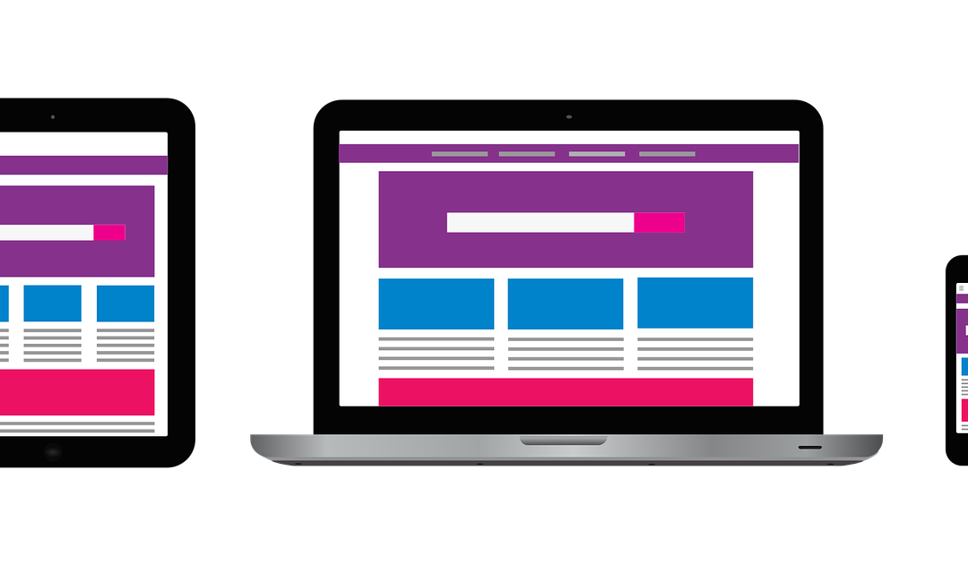
If, however, you have a desktop website that is not performing as desired or due to age is in need of a rebuild, then no doubt a responsive website would be the recommended route to pursue. A responsive website requires more design and development time than a conventional website, however, the benefits are worth it. A responsive website will ensure that no matter the device visitors are using the website will adapt to the screen size and provide users with the best browsing experience possible.
Why exactly is Responsive Development the way to go?
Google Recommends adopting a Responsive Website
One main reason and perhaps the most important business reason for adopting a responsive website is because Google says so! If you are a business wanting to promote your products or services online you should be listening to what Google recommends…after all around 90% of all UK searches are via Google. Google recommends responsive web development for SEO because it is more effective for Google’s spiders to only have to crawl one website with the same HTML source code regardless of what devices the site is being viewed on. If you had a separate mobile and desktop website then this would be treated by the spiders as separate entities thus a reduction in the crawling efficiency.
Conversion Rates
Having a separate mobile and desktop website leaves tablet users in somewhat of a void. What site do you elect to display to users on a tablet? What tablet is the user using to view your website? In recent months there are many tablet options for users to choose from all with different screen sizes which means making a decision on whether to show the mobile or desktop version of your website very difficult. Having a responsive website solves these questions by responding and adapting to the screen size the user is using no matter what device they are using. The upshot of having a site optimised across all devices is no matter what screen it is being viewed on, it will be optimised for increasing your chance of converting into a sale or enquiry.
Cost-effective
In the vast majority of cases building a responsive website is more cost-effective than building a separate mobile and desktop website. The reason for this is that most businesses already have a desktop website which can be a number of years old, meaning that building a mobile optimised website that uses the same administration section as the older desktop website is time-consuming and can result in a high amount of development time. A responsive website only has one set of coding to enable optimisation across all devices.
Ease of website analysis
Analysing your website performance when adopting a responsive website can be a lot less painful than doing this with a separate mobile and desktop website due to only having a single set of source code. Implementing funnels and goals is far simpler when dealing with one set of source code which is responsive rather than having set up multiple goals for separate mobile and desktop websites.
Maintenance
Responsive websites, when compared to separate mobile and desktop websites, are far quicker to maintain fresh content due to having one set of content to manage. Separate versions of a website mean that any content errors or new content that needs updating has to be done multiple times and can quickly become time-consuming.
Interested?
If you feel its about time your business future-proofed its website, please get in touch for a chat about how we can help you ‘go responsive.
Recent Comments